Find an Agent
Zillow Group / Trulia
Objective
We wanted to improve the consumer facing agent directory experience to help buyers and sellers find and connect with agents. We felt we could surface more relevant information to help the consumer decide which agents to learn more about, and ultimately contact. We started off this project with recommendations, but in the end we switched to five star reviews as our agent profile redesign moved forward.
Role
I was the sole designer on this project, working with a product manager and team of engineers.
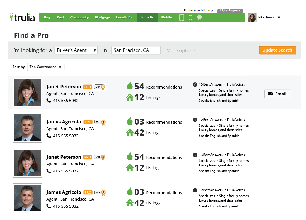
Here’s where we started:

As you can see, there was a lot going on.
Early wireframes
After some initial sketches, I put together a bunch of rough wireframes to test out ideas visually. The product manager I worked with on this loved to print these out and draw on them, and I found that style of communicating ideas very effective because we could both see them visually on paper.


Introducing research
I was trying out different layouts, and surfacing different metrics. Ultimately we decided to keep the top bar layout in order to remain consistent with our property search, which was also going through an overhaul at the time.
But how to decide what else was most important? To determine what information to surface in the limited space for agents, we conducted a round of user testing. It was in this user testing that we determined our iconography around recommendations was confusing. Facebook had dominated recognition of the "thumbs up" icon, and most of our participants thought it meant that the agent had been liked on Facebook, instead of being recommended by a client or colleague. Fortunately, we were soon moving to five star reviews, so the "thumbs up" icon would not be an issue anymore.
In user testing, we also found that consumers cared most about reviews, followed by an agent’s experience in the area where they are searching. Consumers were much more interested in agents with photos than those who had not uploaded a photo; agents without a photo seemed suspicious to them. Consumers were also concerned that agents with a large amount of Active Listings would be too busy for them, so that was a consideration as well. We also determined that consumers were unlikely to contact the agent from this condensed view; they were much more likely to click through to the agent's profile first, and contact them from there.
Final design
The final design was in use on trulia.com through the beginning of 2018. Some of the choices that we made in finalizing the design included only displaying the contact button on rollover, making sure we surfaced reviews prominently, showing the agent's activity in the location that the user entered for their search, and prioritizing agents with photos over agents without a photo. We also rolled up several search parameters into the search bar at the top so the user may filter down the list if they wish to find someone that specializes in something more specific or has a specific qualification.
